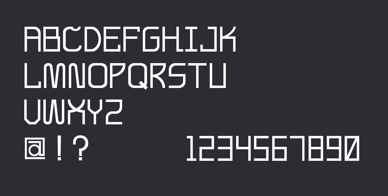
Analex Font
My first try at typography
Winter 2019 | Creator
Project Summary
As I started to learn more about User Experience and interface design, I found myself really drawn in by typography. It was something I had paid some attention to before, but learning more about the thought that went into creating them and the other fonts that influenced them really excited me, so I decided to look into creating one to get more insight into the process. In the end I had a font that I am happy with but also left me with the feeling that I want to create a better one in the future.
Objectives
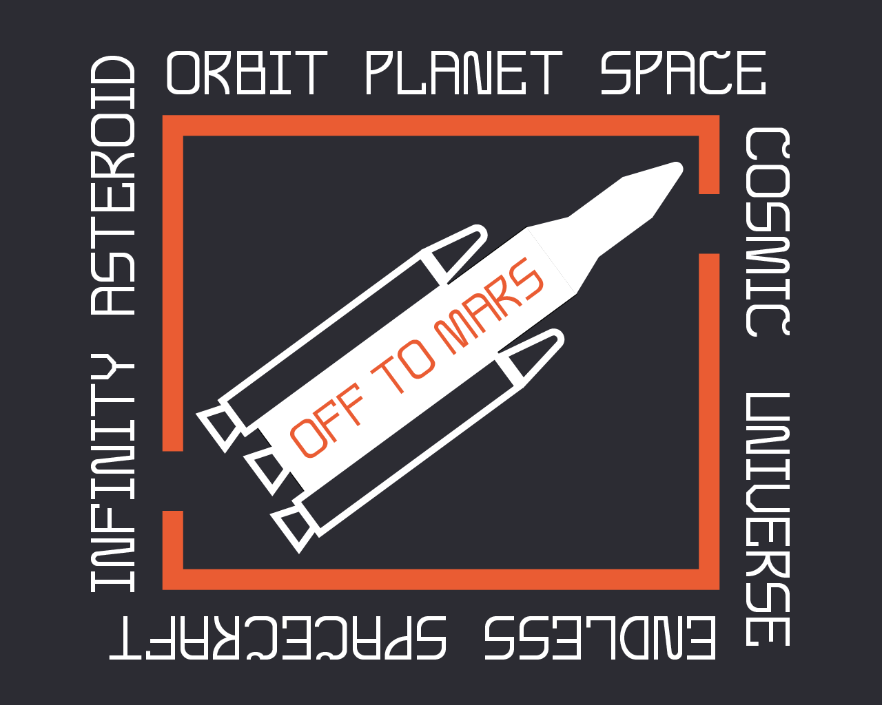
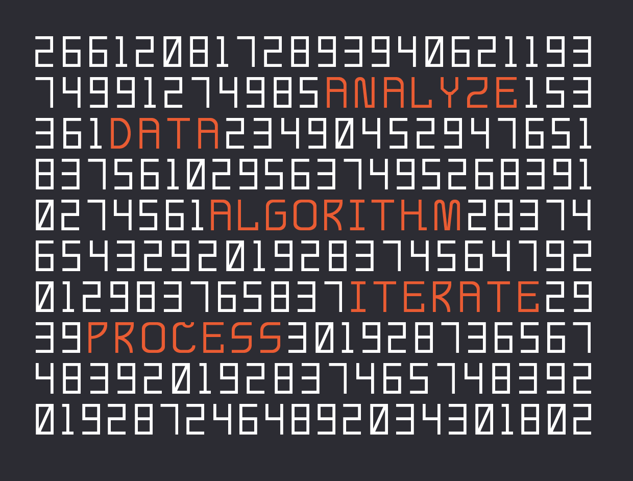
To keep things simple, I decided to make a display font, and only create the uppercase letters. This allowed me to focus less on the readability of particular characters, as well as decrease the workload dramatically, which made it a lot easier to follow through on finishing the font instead of getting overwhelmed by the volume of work and stopping partway through.
Process
The tool I used was FontForge, an open source font editor, because it's free and several places online recommended it. FontForge is a very capable font editor, but its user interface is pretty rudimentary and it's confusing to use if you've never used similar software and are new to font editing in general. To make designing easier, I used Adobe Illustrator to create the letterforms and then imported them into FontForge to make tweaks and smaller adjustments.
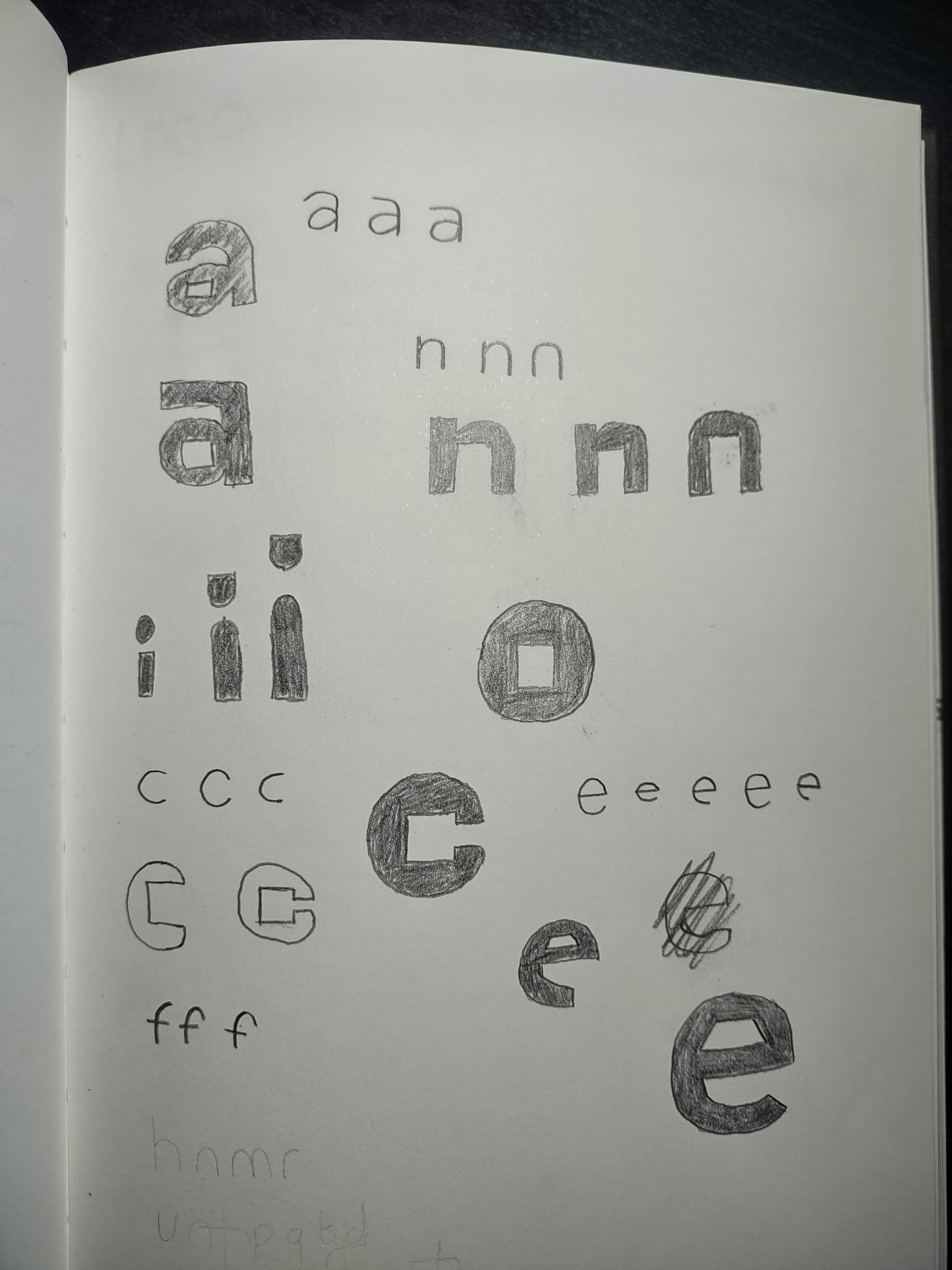
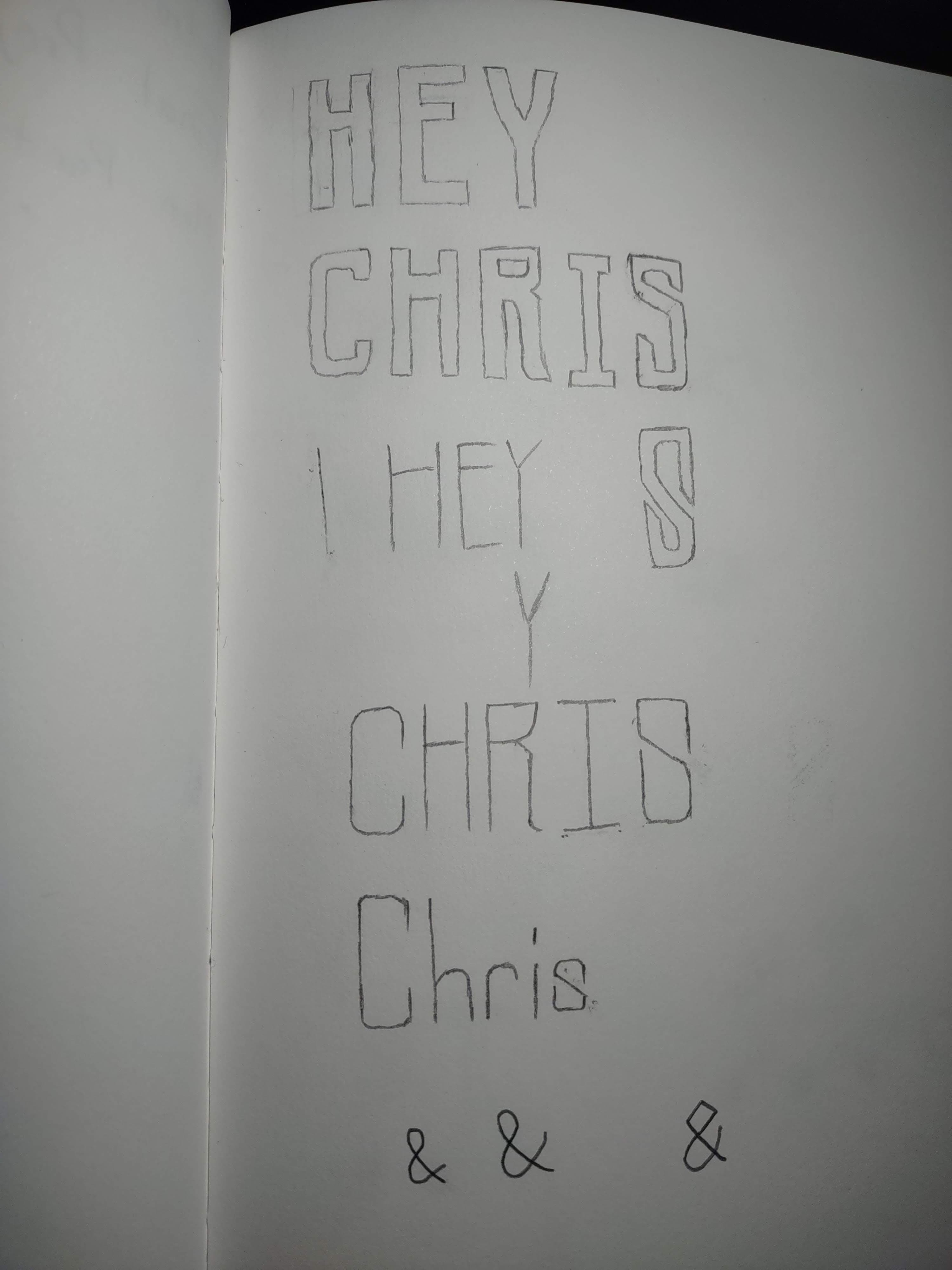
I chose a blocky, geometric style for the font because it made it easier to maintain a consistent style across all the letterforms while still offering a lot of room to play around with different ideas and make the font my own. I ended up with a font that to me looked like something you would see in a sci-fi movie, and I decided to lean into that and made a few changes to support that style.
Challenges
The ideation and design of the font's letters was also a slight challenge, but solving that problem was mostly a matter of trying out different ideas until I was happy with how things looked. If I had chosen a less blocky style that had more curves, I would have spent a lot of time struggling just to make many of the curves look consistent, much less make them look visually appealing.
Using FontForge was the biggest challenge to overcome. Doing most of the design work in Adobe Illustrator took a lot of the load off, but there were still some problems like a requirement that the outermost path of a glyph be traced in a clockwise direction that I had never heard of before and had to correct using unfamiliar tools. There were also some more behind-the-scenes settings for things like letter spacing and line height that I had to figure out. It seems to me that FontForge is capable of creating great fonts, but it would definitely take a lot of time learning the software and experience in making fonts to bring out its potential.
Result
Creating Analex was a very enjoyable process, and I'm proud of the end result. I learned a lot about the intricacies of font-making, and my appreciation for typography has grown as a result. It was also good exercise in learning how to use unfamiliar software for an unfamiliar task, which made me think a lot about usability and how FontForge might be improved.